Paragraph Module Heading
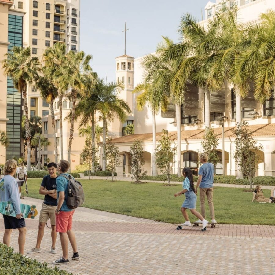
 The Paragraph module can also be included as field within other modules. The Paragraph module will make up the bulk of the content within your site. Within the Paragraph module/field you can create subheadings H2 (larger) through H6 (smallest). You also have a number of formatting options including bold, italic, bulleted lists, ordered lists, blockquote, text alignment options, and means to create a link. You can also add media items such as the photo to the right.
Headline (Ordered List)
- Lorem Ipsum
- Lorem Ipsum
- Lorem Ipsum
- Lorem Ipsum
Headline (Unordered List)
- Lorem Ipsum
- Lorem Ipsum
- Lorem Ipsum
- Lorem Ipsum
Heading 3
Heading 4
Heading 5
Heading 6
Headline (Split Column)
The Split Column module is a great way of including a large amount of text in a small amount of space on the page. The fields involved are just a Heading, and the Content field (Paragraph field). The module automatically splits the text into two separate equal columns of text leaving little guesswork into how to split the text.
Headline (Feature Panels)
Below are two examples of Feature Panels. The first panel is right aligned. The second panel is left aligned. The Feature Panel module requires you to select from a list of existing Features. After logging into WordPress, you can view the existing Features, or create a new one here. You can also choose a background style for this module. The choices for the background style are background Image, or a blue background. The fields for a Feature Panel include: Title, Heading, the Full-width Background Image, Thumbnail Image – a smaller image used on tertiary template and on full-width’s blue background variation, Description Text (paragraph field), Links, and finally you can choose between button styles “Call to Action” and Plain buttons.

Feature Panel Heading Text
Vivamus dui ante, condimentum non purus bibendum, ultricies luctus sapien. Nunc vel sodales dui, at tincidunt turpis. Aenean ut augue dui. Donec mollis nisi ac ex semper, id aliquet massa gravida.

Explore West Palm Beach
Aenean et tortor at risus viverra adipiscing at. Vulputate eu scelerisque felis imperdiet proin fermentum leo. Maecenas accumsan lacus vel facilisis volutpat est velit egestas dui. Magna eget est lorem ipsum dolor sit amet consectetur adipiscing. Sed id semper risus in hendrerit gravida. Ut enim blandit volutpat maecenas volutpat blandit aliquam etiam erat. Donec massa sapien faucibus et molestie ac feugiat. Elementum eu facilisis sed odio morbi quis commodo odio aenean. Tempus quam pellentesque nec nam aliquam sem et tortor consequat. Auctor urna nunc id cursus metus aliquam eleifend mi. Vestibulum sed arcu non odio euismod lacinia.
Headline (Accordion)
The Accordion module allows you to present a great deal of information in a small area. Accordions can be used to nest/conceal further information about a topic. Accordions allow the user to browse through a list of content and click to expand on a topic of interest, making the information easier to browser through. Each Panel within an accordion consists of 3 fields: Header, Content (paragraph field), and an optional Link. As with any link, you must include the URL of the link and the link text.
Accordion Group Example
Ut ullamcorper lectus nec arcu consectetur iaculis. Integer tempus rutrum urna. Quisque at metus vel nibh dictum facilisis at interdum augue. Nam vel ultrices dolor. Aliquam at nunc in sapien tristique tempus ac quis metus. Duis quis ligula lectus. Nam pulvinar elit turpis, a consequat leo tincidunt et. Quisque nec neque id elit rhoncus tempor a a mauris. Praesent ultricies ex ut elit vulputate, eget auctor sapien imperdiet. Aenean porttitor ut neque eu volutpat. Etiam eget semper nunc, nec consequat nunc. Vivamus tincidunt lobortis turpis at placerat. In bibendum consectetur diam, vel rutrum elit convallis sed. Nullam sodales lorem nec libero maximus luctus.
- Donec tristique neque vel sapien malesuada aliquet.
- Vestibulum volutpat, nisl maximus placerat bibendum, augue elit ultrices lorem, eget blandit justo nisl non sapien. Ut eget sapien in ligula auctor blandit. Cras non lacinia nulla, pretium interdum metus.
- Vestibulum vestibulum, ipsum ac vulputate tempus, urna ipsum feugiat mi, quis vulputate tortor odio non est.
- Pellentesque eu diam leo.
- Donec non pellentesque velit, et pellentesque mi. Etiam faucibus sit amet felis et vestibulum. Suspendisse porttitor cursus enim, sed dapibus libero sagittis vulputate. Integer sed nunc est.
- Nulla feugiat, ante quis lobortis tristique, diam mi porttitor purus, vitae rutrum magna metus sed tellus. Suspendisse felis metus, volutpat eu magna vitae, rutrum interdum nunc.
Lorem ipsum dolor sit amet, consectetur adipiscing elit. Integer ultricies elit a pharetra hendrerit. Pellentesque finibus diam mauris, vel efficitur ex sollicitudin non. Mauris augue est, ornare ut felis eget, ornare vulputate purus. Interdum et malesuada fames ac ante ipsum primis in faucibus. Nunc in arcu eu sem rutrum imperdiet sed in lacus. Integer pulvinar egestas leo ut tincidunt. Sed a eros maximus, mollis nisl vitae, congue lorem. Ut nec tempor quam.
Headline (Table)
The Table module allows you to insert already made tables from the TablePress plugin. You may view existing tables or create a new table using TablePress here. To insert an existing table, there are only a couple of fields: Heading, and Table (There’s a Grid Icon that opens a pop up window with all the existing tables).
If you would like to create a new table, the first step requires suppling a Table Name, and optional Description, Number of Rows, and Number of Columns, then click Add Table. Next the Table Content will appear in the form of numbered rows, and lettered columns. Below the Table Content is a Table Manipulation section where you can insert links, insert images, hide or show selected rows or columns. You may also duplicate, insert or delete rows. Finally, you can add additional row(s) or column(s). Towards the bottom of the page, there are a list of Table Options that allow you to make the first row of the table be the table header, alternate background colors of consecutive rows, and highlight a row while the cursor hovers above it.
Table Example
| Column | Column | Column | Column | |
|---|---|---|---|---|
| Row | 53,000 | 23,000 | 48,999 | 20,888 |
| Row | 53,000 | 23,000 | 48,999 | 20,888 |
| Row | 53,000 | 23,000 | 48,999 | 20,888 |
| Row | 53,000 | 23,000 | 48,999 | 20,888 |
| Row | 53,000 | 23,000 | 48,999 | 20,888 |
Headline (Full Width Image)
The Full-width Image module is a pretty simple module. The only fields required are the actual Image and a Caption field.

Headline (Video Embed)
Likewise, the Full-width Video Embed is a pretty straight forward module. The fields involved are the Video URL (typically a YouTube URL), Image (This static image displays before the video is played), and a caption field.
Headline (Events Panel)
If you would like to bring attention to a certain event(s) you can always highlight them by using the Event Panel module. The fields involved with an Event Panel include: Heading, a CTA Link (normally something like “See all Events”), Display Type which includes two choices “Filtered” or “Curated” (If filtered is chosen you may select a category to show the three most recent events from. If curated is chosen you may select three specific events to display.), and lastly the Category(s) of the events (you may choose multiple categories). The example below uses a Curated Display Type.
Events Panel Example
See All EventsHeadline (News Panel)
The News Panel is very similar to the Events Panel, but this module highlights news items. The fields involved with a News Panel include: Heading, a CTA Link (normally something like “See all News”), Display Type which includes two choices “Filtered” or “Curated” (If filtered is chosen you may select a category to show the three most recent news items from. If curated is chosen you may select three specific news items to display.), and lastly the Category(s) of news (you may choose multiple categories). The example below uses a Curated display type.
News Panel Heading
See All NewsHeadline (Faculty Profile Listing)
The Faculty Profile Listing is very similar to the Events and News Panels in that you have to decide on a Filtered Display Type or a Curated Display type. If filtered is chosen you may select a category to show a number of the most recent profiles from. If curated is chosen you may select a number specific profiles to display. Other fields required include: Heading, and Category fields. You can view existing faculty profiles or create new ones here. In order to create a new faculty profile, the following fields are required: Title, First Name, Last Name, Credential Title (Ph.D, etc.), Featured Video, Image, Biography (Paragraph field), Position, Office, Phone, Email, and finally Fax number.
Faculty Profile Listing Example
View All FacultyHeadline (CTA Panel)
Finally on the bottom of Tertiary pages there is a checkbox for Display CTA Panel. If enabled, you may add a Background Image, or Background Video, Heading, Intro Text, and finally the CTA Links. You may only add up to three CTA Links and for each link you must supply a URL and Link Text.